

A friend of mine recently showed me some infographics he was working on for his weather blog, and he had the idea of creating some 7-day forecast graphics; you know, something like this:
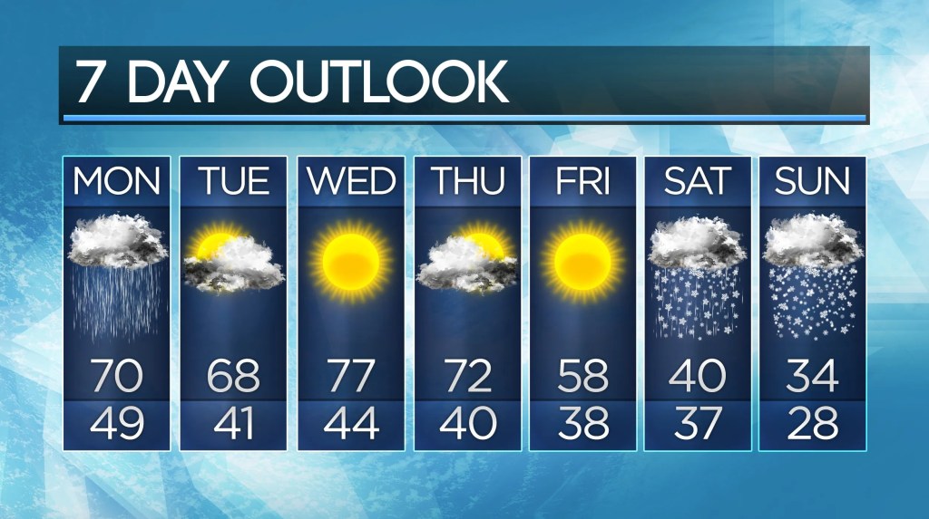
He has been using Python to create some pretty cool charts for showing daily highs and lows along with precipitation chances. However, these charts were being generated with Python’s matplotlib library, which is wonderful for charts and diagrams, but has some limitations when it comes to creating more complicated designs.
That is when I had the idea to generate a 7-day forecast diagram using a web frontend framework. I decided to draft up an application using React Router v7, a replacement to the retired React frontend framework. This utility is a Single Page Application (SPA) that accepts a YAML file containing forecast data, i.e., daily high, daily low, precipitation chance, and overall condition. It parses this file and creates a downloadable image like the one below:
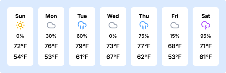
It’s minimalist, clean, yet yields all the essential information for a weekly forecast. This product is available on GitHub, and instructions for installation and usage are available in the README. Version 0.0.0 has been released on GitHub, and further updates are planned to improve the forecast chart and also provide other useful infographics.
In the meantime, I highly recommend following Trent’s weather blog, especially if you are in the Middle Tennessee / North Alabama region! We will most likely be collaborating on more data-driven, programmatically generated infographics of this nature for his weather updates. As always, once updates are released for this product, I will be posting about it here. Make sure to subscribe for post notifications, and check out my GitHub to see my other projects!
